
First of all, what is UI? User Interface (UI) design is the process of making interfaces in software that users will find highly usable, efficient, and intuitive.
This is central to how we interact with technology on a daily basis, which is why SaaS companies care so much about it. As user habits and preferences evolve, and as technology itself evolves, good UI design evolves with them.
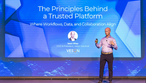
Veson is committed to delivering the best experience for all users of our commercial maritime cloud solution, the Veson IMOS Platform. We believe that digital technology can be a powerful tool, but only if it is designed with the end user’s needs in mind. It is for this reason that our usability team is constantly working on ways to help users do their jobs better. Today, Veson is excited to announce new enhancements to the Platform’s interface that help improve user experience and efficiency.
One of the most noticeable enhancements is the updated look and feel of the system. These enhancements focus on improving contrast and consistency, utilizing clearer labels for more intuitive navigation, and prioritizing the most important information through strategic use of space.
These enhancements to the user interface (UI) not only boost the Platform’s visual appeal, they were strategically designed to streamline user workflows.
Improved contrast and consistency make navigating the Platform more intuitive, enabling users to quickly find the information they need. The navigational changes also make it easier for new users to acclimate to the system, enabling your team to onboard users more seamlessly. Clear, written labels also make it easier for new and experienced users alike to find their way around the platform.
TIP: you can type Ctrl + F to search for buttons on the screen.
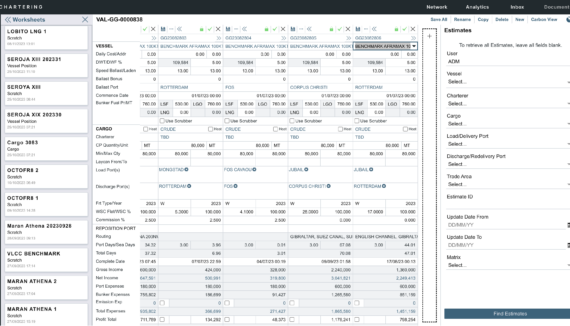
With the sheer amount of data that hits your system in any given day, we understand how easy it can be to get bogged down in the details. Since VIP allows you to view, work with, and report on data from a wide spectrum of sources, it’s important to illuminate only the most vital details so that you can make business-critical decisions. New enhancements to better utilize the space on your screen will help you focus on the most important information and avoid the dreaded “analysis paralysis.”
Along with the look and feel, there are several additional usability improvements, including:
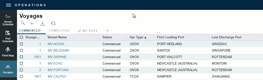
Simplified Top Navigation
![]()
The top navigation bar gives you access to the main menu, which shuttles you to the various modules and workspaces in VIP. To improve users’ experience, the top navigation now features a simplified, sleek design with a shorter bar height and high contrast menu buttons, which stand out when you need them and stay out of the way when you don’t.
One of the driving factors behind updating the top navigation bar was to create more space on your screen for business-critical data. Modern monitors are almost twice as wide as they are tall, making screen height a premium. Our new navigation bar is nearly 30% shorter to help you see more information without as much scrolling.
More User-Friendly Lists
Lists appear quite frequently in VIP. By making some adjustments to list functionality, we were able to better leverage lists for more intuitive and centralized navigation.
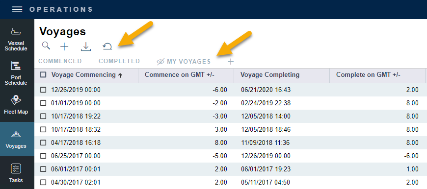
First, list functions and user views have been relocated to appear below the list title; list actions now appear in the same location as workspace actions to make action location more consistent and obvious. Standardizing list functions across VIP enables experienced users to navigate more intuitively and new users to get acclimated easier and faster.
Second, the list search button now enables users to search on hover. In other words, search is now treated like any other action a user can take on a list. This unified and minimalist view of list functions allows you to complete tasks in fewer clicks and adds to the visual consistency of the toolbar.
Finally, lists now incorporate collapsible column grouping and bulk actions, meaning that additional row level actions only show up when you need them. The drag-and-drop grouping row will remain hidden until you start dragging a column, and the bulk action row will remain hidden until a row check box has been selected. When displayed, available bulk actions appear to the left of the list buttons. By revealing information progressively as needed, your screen is less cluttered, and you can move through workflows more easily.
Explicit Labeling of Workspace Panels
Thanks to user feedback, we discovered that including labels in the workspace panels would provide added clarity. Labels now identify what each icon represents and describe the information available on each panel.
TIP: on smaller screens, the toolbars still collapse to maximize the available space for content. Hovering over the icons will provide a tooltip indicating the title of the panel.
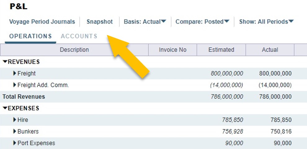
Clearer P&L Layout
Within the expanded Voyage P&L view, we moved some buttons and drop-down menus around to make P&L actions more centralized and easier to find.
As the maritime industry shifts and evolves, technology must also improve and adapt to changing needs. Veson’s ability to evolve its solutions has always been core to our development methodology, and is continuously supported by the insights and feedback that we receive from our community – thousands of maritime professionals from all corners of the industry. Our commitment to continuous development is inspired by these innovative leaders, who helping to chart the future of shipping.
As always, we are interested in hearing what you think. If you have feedback on the new enhancements, or additional ideas for product development, please submit a request or upvote existing requests on the Veson Feature Board.