Welcome to Lesson 5 in our Python SDK learning series. Each lesson is independent, but make sure you check out Lesson 1, Lesson 2, Lesson 3, and Lesson 4.
In recent weeks dry bulk rates have rallied and attracted the World’s attention. Most of the articles written on this topic explore the underlying causes for the rally. In this Python Lesson, we explore which freight indicators are correlated to the price development. We use some of the freight indicators that are available via the Oceanbolt Data Platform, e.g. fleet utilization, volume exported, congestion, fleet speed, and port calls.
As a proxy for freight prices, we use the Breakwave Dry Bulk Shipping ETF. The ETF is described as follows: “The Breakwave Dry Bulk Shipping ETF (BDRY) is an exchange-traded fund (ETF) designed to reflect the daily price movements of the near-dated dry bulk freight futures. BDRY offers investors unlevered exposure to dry bulk freight …” (source: https://etfmg.com/funds/bdry/ ). You can learn more about it by visiting the link. As evident by the description, this ETF should follow the dry bulk freight price development closely and will therefore serve as a great proxy for our purposes. Using the BDRY price as a proxy for freight prices has an additional advantage that it is available via the Yahoo Finance API, which allows us to quickly grab the price development using yfinance in our Python script.
We want to highlight that this article focuses on showcasing the functionality of the Oceanbolt Python SDK rather than being a piece on the data science of shipping (we leave that to the experts).
As always, you can follow along in this Jupyter Notebook or read the summary below.
Correlation of BDRY and Oceanbolt Fleet Utilization
As discussed in Lesson 1, fleet utilization is one of the popular indicators for assessing the activity in the dry bulk shipping market. The economic rationale is that increasing fleet utilization means less available vessel supply which, in theory, should drive freight prices higher. Let us test whether this is the case.
Here is a sample of the code from the Jupyter Notebook.
BDRY = yf.Ticker("BDRY")
   hist = BDRY.history(period="max")

   total_tonnage = tonnage_zone_client.get(
     start_date=date(2018, 3, 22),
     end_date=date(2021, 5, 12),
     )

   unemployed_tonnage = tonnage_zone_client.get(
     laden_status=["ballast"],
     port_status=["at_sea"],
     start_date=date(2018, 3, 22),
     end_date=date(2021, 5, 12),
     )

   fleet_utilization = pd.DataFrame(1-unemployed_tonnage['vessel_dwt']/total_tonnage['vessel_dwt'])
   fleet_utilization['date'] = total_tonnage['date']

   fleet_utilization['date']= pd.to_datetime(fleet_utilization['date']).astype(str)
   hist['date'] = hist.index.astype(str)
   merged = pd.merge(hist, fleet_utilization, how='left', on='date')
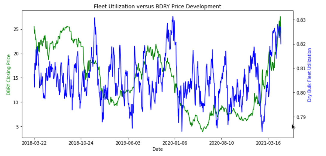
When visualizing these results, we get the chart below.

Arguably, this is not a perfect indicator, but let us calculate the Pearson correlation using Scipy.
r, p = stats.pearsonr(merged['Close'], merged['vessel_dwt'])Running this gives a correlation of 0.289 and a highly significant p-value. As expected by the economic rationale, there is positive correlation between utilization levels and freight prices. Yet, it is far from a perfect indicator.
Let us see if other freight indicators can do better.
Correlation of other Oceanbolt freight indicators
As suggested, we move onto test correlation of volume exported, congestion, fleet speed, port calls. We outline the economic rationale below.
- Volume Exported: Measured as daily total dry bulk volume. More volume exported would imply higher demand for vessel capacity
- Congestion: Measured as the percentage of the dry bulk capacity in DWT that is congested. More congestion would imply less vessel supply
- Fleet Speed: Measured as the average speed across the fleet. A faster fleet provides more capacity and also indicates market sentiment
- Port Calls: Measured by number of global port calls of the dry bulk fleet. More port calls is a proxity for more fleet activity
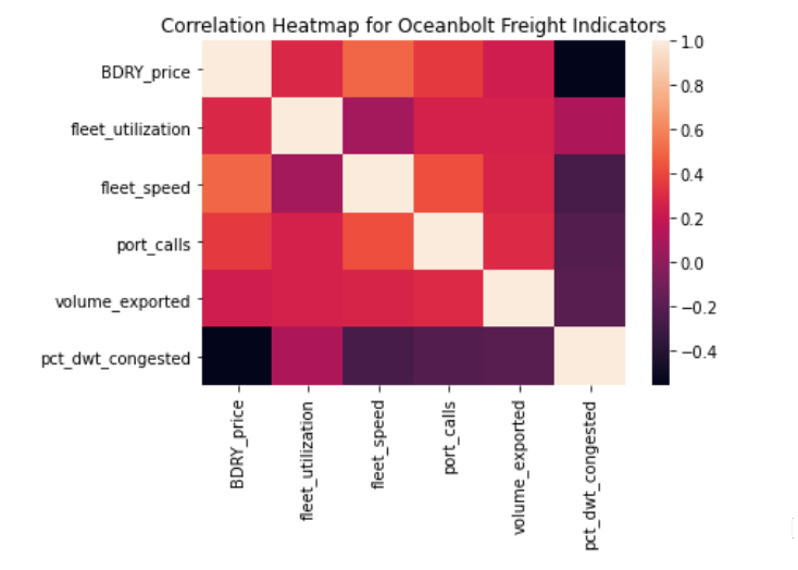
See the Jupyter Notebook for the code that we run to get these indicators. We construct a correlation matrix and correlation heatmap of the indicators.


From this, it is certainly evident that some of these indicators have stronger correlation with the BDRY price development. We will leave the interpretation of these numbers to the shipping community. Certainly, some of these could be interesting to explore further. Maybe you even want to use some of these as building blocks for a machine learning model for freight rate predictions. We leave that up to you, but with Oceanbolt you have the building blocks needed.
Thanks for reading this! If you are interested in getting access to our data, sign up for a product demo and stay tuned for future lessons!


